I’ve been doing a lot of research lately on another company that we are competing with. Within five minutes of Google searching, it quickly became obvious that their website is woefully inadequate. Their site is 2-3 static pages of fluff (the majority of which is focused on their CEO’s history and accomplishments). They don’t mention what jobs they have, what their culture is like, or what kind of benefits they offer.
In short, it’s pretty darn crappy for anyone showing up there looking for information, including job searchers.
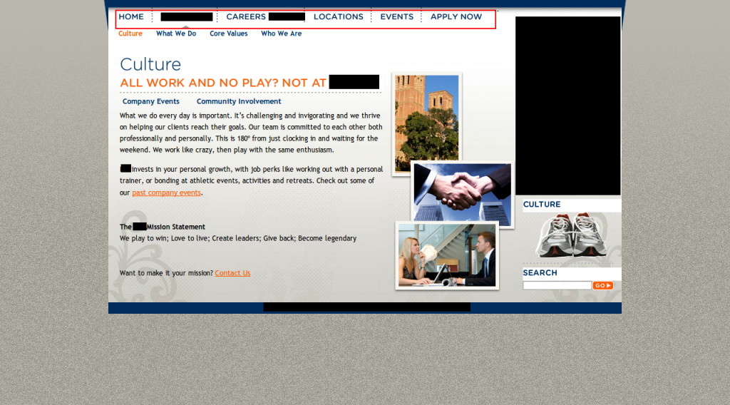
Let’s compare that with another company I ran across in my research. They aren’t a competitor, but I’m glad, because they look like an amazing company who people would be tripping over themselves to work for. In the screenshot below (click to make the image larger), you can learn some of their cultural norms, their mission, and there’s even a compelling call to action for job seekers at the end.
Here’s the text if you can’t read it:
Our Mission Statement
We play to win; Love to live; Create leaders; Give back; Become legendary
Want to make it your mission? Contact us.
Some of the differences in between these companies are obvious, and others are not, but job seekers are going to have a much better candidate experience at the second company than they would at the first! Step back, think like a job seeker, and take a look at what your website looks like. Is your greatness showing?Â

Leave a Reply to HRBlogNetwork Cancel reply
You must be logged in to post a comment.